
Tuesday, 26 November 2013

Friday, 22 November 2013
Photo-shoot - Edited Photos

I have edited some of the photos I have taken. On most of
the photos I used a clone stamp from Photoshop to get rid of unneeded objects
e.g. the date of when it was taken. On other photos I simply used a black and
white effect. I have also changed the brightness and contrast of the photos as
well as the exposure.
Tuesday, 19 November 2013
Photo-shoot


Theses are some of the photos which I have taken which I could possiblity use for my products. I am going experiment with editing some of the photos as they could improve some of the photos I have taken already - as some are too dark so its hard to see the image.
Thursday, 14 November 2013
Feedback on Mock Ups: Double Page Spreads

I have asked a various of people their opinion on my double page spread so I know the strengths and weaknesses of this mock. In addition, how I can improve it for when I make my final product. The feedback which included what the strengths and weaknesses were on my mock up. A strength of my product according to the people I asked was that, they liked how I have used a various of fonts; they said it helps to make the magazine look more eye-catching. They said that having the names labeled on the smaller pictures can make mock up look more professional. In addition, it can give people who don't know the band an idea about who they are. Some weaknesses of this mock up is that the some of the text is too small - so it is hard to read. Another weakness which they said is that they don't like the font colours red and blue - as they said it is too contrasting and can distract your attention from the article.

I am going to then ask people the strengths and weaknesses of my mock up are. A strength which I got from feedback is, that the bright colours are good as they catch your attention. They liked how I had used the band's logo as part of my font. However the weaknesses of this mock up is that is that the font which I have used for the interview is too small so this makes it hard to read. In addition, as I have used bright colour for the text and it is hard to read the writing. To improve this in future if I have a black background I should use white text as it will make the text clearer to read.

I am going to get feedback on the strengths and weaknesses of this mock up. A strength of this mock up is that it is good that the image is one page - as you can see the singer clearer. In addition it show that this interview is all about her. However this could be seen as a weakness as having an image just for one page, can be seen as taking up too much space. The feedback I got said they liked how I have used a various of fonts. However a weakness of this mock up is that the text writing is too small - making it hard to read. Furthermore, the amount of different coloured text can be seen as a weakness as it can draw the reader's attention away from the article.
Monday, 11 November 2013
Feedback on Mock Ups: Context Pages

I will now get feedback from various people so that I know
the strengths and weaknesses of my mock. A strength of this context page is
that it's not too busy; so your attention isn't drawn away from the context
page. They said they liked how I have used a various of fonts as it can make
the mock up look more professional, as the use of different fonts is a common
convention magazines use. Another strength of this mock up is the text
"Context page" is placed over the top of the main image - this can
cause the audiences' attention as it bright and eye-catching. However, this can
also been seen as weakness as the words "Context page" take up too
much space on the main image. Another
weakness of this mock up is that the writing is too small; this makes it hard for
the audience to read. To improve this in
the future, I would have to make sure that I use a reasonable size font.

I will ask people what the strengths and weaknesses of this mock up are so that I know in future how to improve my final product. From feedback I have found out that a strength of this mock up is that they like how the background is a picture of the band - as it can show that the band is a main feature in this issue. Another strength is that they like how I have used again a various of font - varying from sans serif font to font that fits into with my genre. Another strength is that I have used the same font for my masthead for the title of this page - this can emphasis that I have followed a clear house style. However, a weakness for this mock up is that the text is too small and is hard for my target audience to read. Additionally, the images on the right-hand side can be seen as a weakness as some of them are too transparent with the background and could distract the reader away from the text.

I have asked a range of people what the strengths and weaknesses of this mock up are. A common strength is that they liked the layout as it looks well thought out. Additionally, makes the context page look not too busier yet there isn't any dead-space. They liked how I had used colours which complimented each other and how the white writing doesn't clash against the background. However, the disliked the size of text and images; the size of the text is too small so it makes it harder for the reader to wear. As well the size of the smaller images can be seen as too small as it could be unclear who are in the images.
Thursday, 7 November 2013
Feedback on Mock Ups: Front Covers

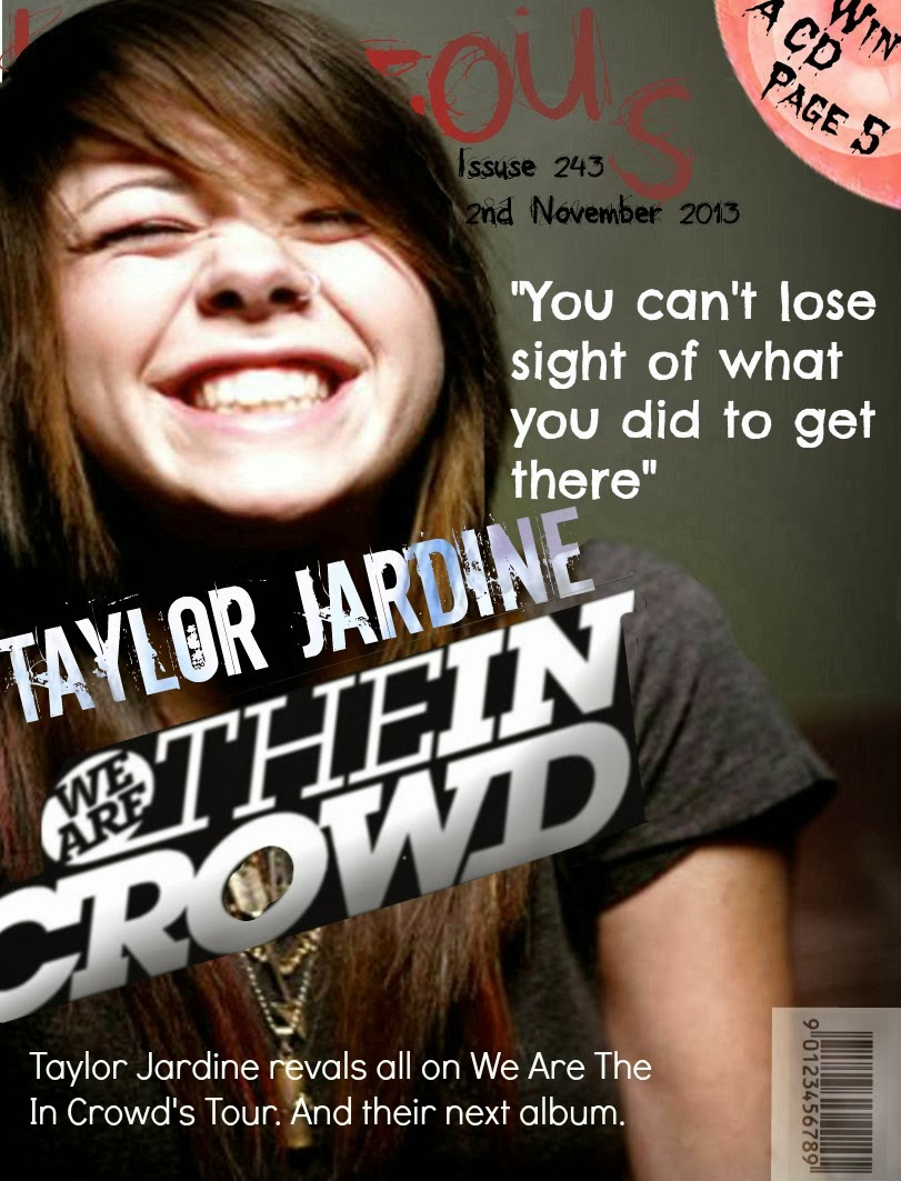
From asking various people I have found out that a strength of this product is that have used a the colours red and black through so this can show I have used a constant house style. However, a weakness of this product is the masthead covers the main image so this stops the band from looking most important. Another weakness is that the bar code looks like its randomly been placed - making the mock up look less professional. Furthermore, the writing on top of kicker is hard to read as it is too small so this stops the audience from being informed about offers in the magazine. Another weakness is that mock up looks too simple and overall looks unprofessional.

Monday, 4 November 2013
Audience Feedback
I asked people which of my mock ups has the best layout and which mock up is more favourable. From doing this, it can help show me which out of my mock ups are more appealing to my taraget audience. In addition, it can help me decide which mock up would be more professional looking.

This tally can show that overall the people which I asked thought that my double page spread which featured the band All Time Low was most effective.

This tally can show that people mainly thought that my we are the in crowd mock up for context pages had the best layout.

 This tally can show me that from the people I asked that my paramore mock up has the best layout.

This tally can show that overall the people which I asked thought that my double page spread which featured the band All Time Low was most effective.

This tally can show that people mainly thought that my we are the in crowd mock up for context pages had the best layout.
 This tally can show me that from the people I asked that my paramore mock up has the best layout.
Subscribe to:
Posts (Atom)