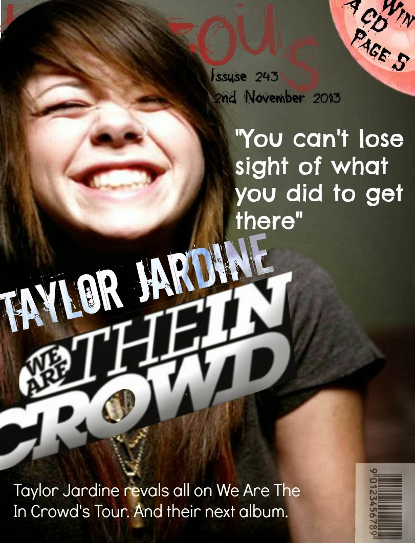
From asking various people I have found out that a strength of this product is that have used a the colours red and black through so this can show I have used a constant house style. However, a weakness of this product is the masthead covers the main image so this stops the band from looking most important. Another weakness is that the bar code looks like its randomly been placed - making the mock up look less professional. Furthermore, the writing on top of kicker is hard to read as it is too small so this stops the audience from being informed about offers in the magazine. Another weakness is that mock up looks too simple and overall looks unprofessional.

I have asked a range of people what the strengths and weaknesses are of my product are. The feedback which I got was that the main image on the cover, stands out which catch the audiences' attention because it is bolder than anything else on the image. Additionally, as it is behind the masthead this can further emphasis that the band are the most important thing in this issue. Another strength is that I have used the bands' logo as a title can draw the audience in. However, a weakness is that some of the text is too transparent so it is hard for the audience to read. Also the text on the kicker is unreadable due to the colour of the font and text size; so this can stop my target audience from being informed about the offers in the magazine.

A strength of this mock up is that I have used quote - so this can give the audience an impression of what the signer is like. Another strength is that the main image I have chosen is good because it shows the singer is happy to be involved with the magazine and this could interest fans of that band. As I have chosen colours that complimented each other this stops the front cover from being too busy. However, in some places the colours can seem quite bland and could put my target audience off. Another strength is that the singer has been placed in front of the masthead so this can show she's very important. Although, this can also be seen as a weakness as now the masthead is unclear so people won't know what the magazine company is.


No comments:
Post a Comment