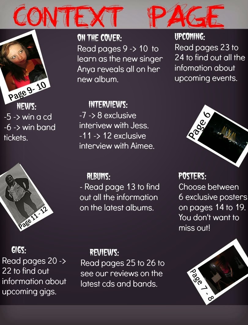
For my context page I first decided what font I was going to use for my heading; I decided that I would use the same font as my masthead as it can show that I have used an organised house style. I had to make sure that I placed a banner behind my font so that it would not mix into the background.
I then decided where I was going to place my images. I
placed them towards the sides of my context page - to create dead space where I
could then place my text. I made sure there were white boarders around my
images to make them see more like photos. I then placed the page numbers which
the images related to on there to give the audience an idea of what would be on
that page or who was being interviewed.

After that I then placed my text around the images and in
the dead space. I tried to pick a decent font size of 14 as it isn't too big
but it would be clear enough on the pages. I chose a san-serif font as it is
modern looking so it will attract my audience; additionally, it is clearer for
my target audience to read.
 Finally I placed banner behind the sub-headings to make them stand out from the page numbers text. I then re-placed my tag line at the bottom of the page to re-emphasis the aims of my product. I also placed a page number in the bottom left corner of the page; I have used the same shape as my kicker as it shows that I have used a constant house style throughout my media products.


No comments:
Post a Comment