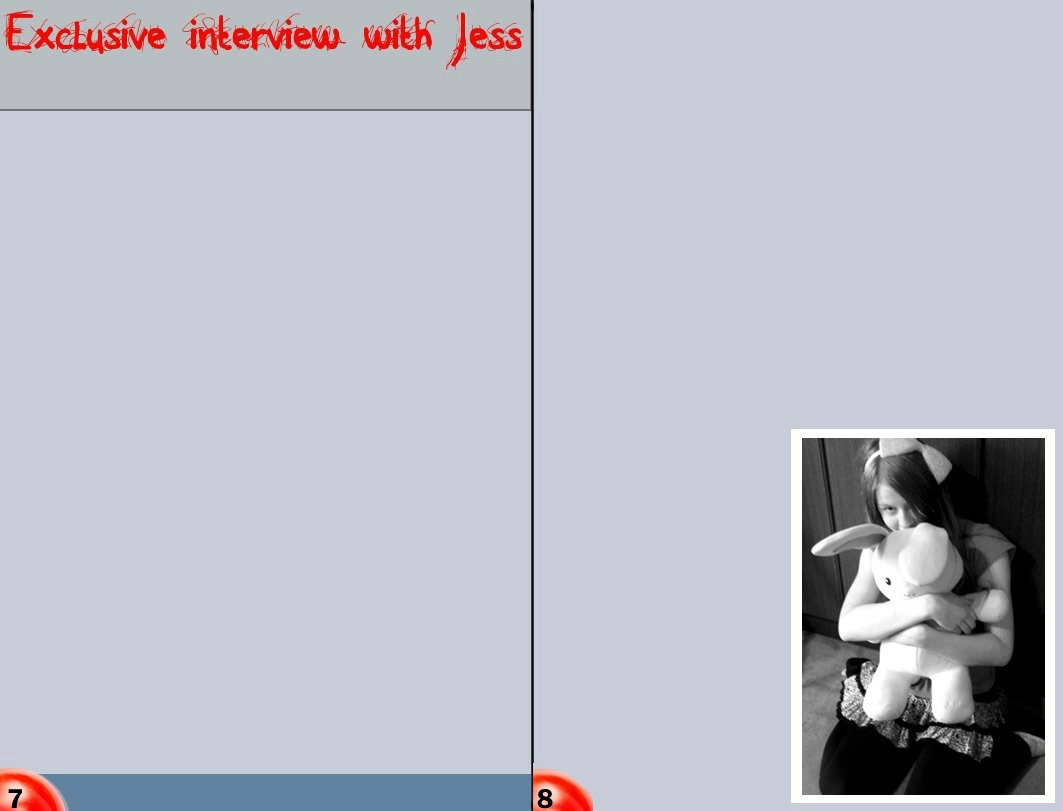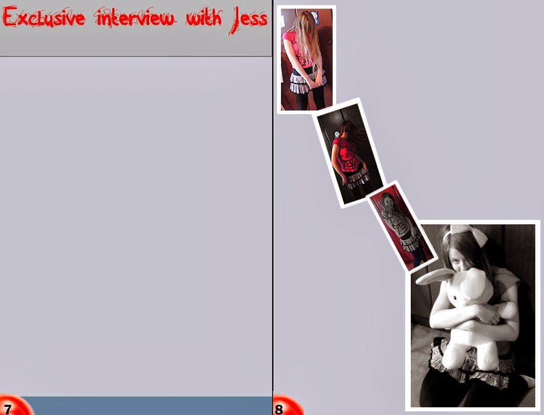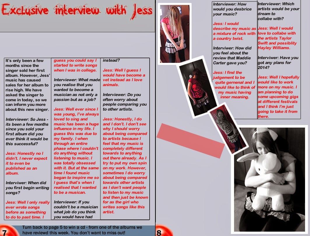
First started to plan where I was going to place everything. I made sure that I left enough dead space which I could later fill in with the interview. I made sure that the text I used for my heading was the same as the font I used for my mastheasd as it shows I have used a constant house style.

After this I then placed the other overlapping images on one side of my double page spread. I made sure that the images were roughly the same size so that they wouldn't take up too much room - however, that they could still be seen clearly.

Then I drew faint boxes in the dead-space to give myself a rough idea of where I was placing the interview. I had to make sure that all the columns' sizes were the same size as it is often a common convention in magazines as well as making the magazine look more professional. Then I began to write out the interview in the columns, making sure that I used a different colour for the interviewer and for the singer. I also put an advertisement for a previous page in the magazine, in the banner by the page numbers as that is often a convention used in magazines.
Finally I added a quote from the singer - to give the audience an impression of what the singer's personality is like. I then also decided to add a chart stating the singer's successes and basic information about the singer's album which would further give the audience a better idea about her. Then I included an picture of the album with a price next to it. Furthermore, I then made sure I had written out a sub-heading and text under the sub-heading to inform the audience what the double page spread is about.

No comments:
Post a Comment