AS Media Studies Foundation Portifio Coursework Holly Savage
Friday, 14 February 2014
Thursday, 9 January 2014
Tuesday, 7 January 2014
Draft of Double Page Spread
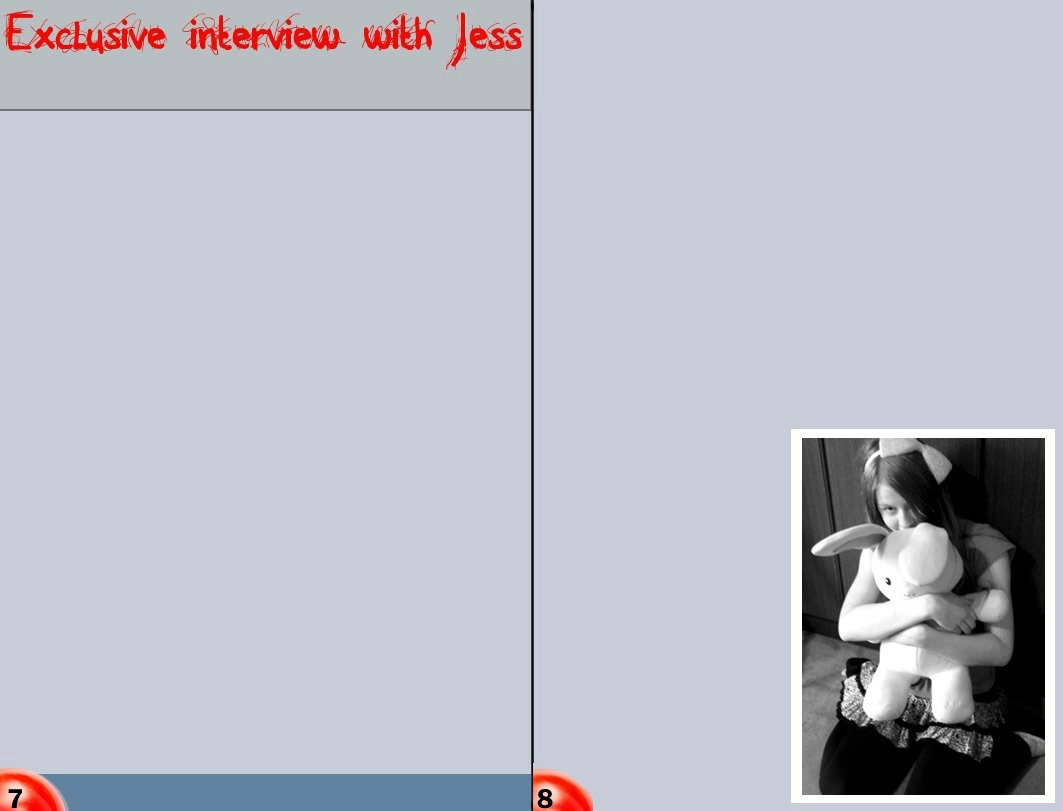
First started to plan where I was going to place everything. I made sure that I left enough dead space which I could later fill in with the interview. I made sure that the text I used for my heading was the same as the font I used for my mastheasd as it shows I have used a constant house style.
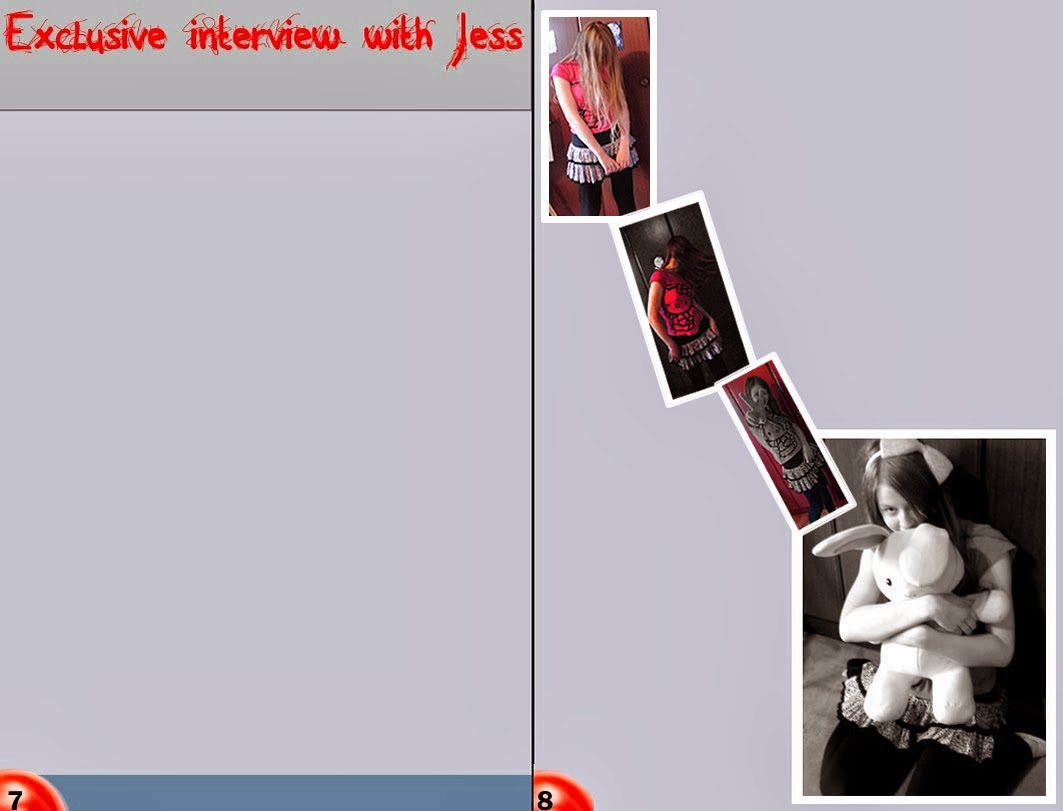
After this I then placed the other overlapping images on one side of my double page spread. I made sure that the images were roughly the same size so that they wouldn't take up too much room - however, that they could still be seen clearly.
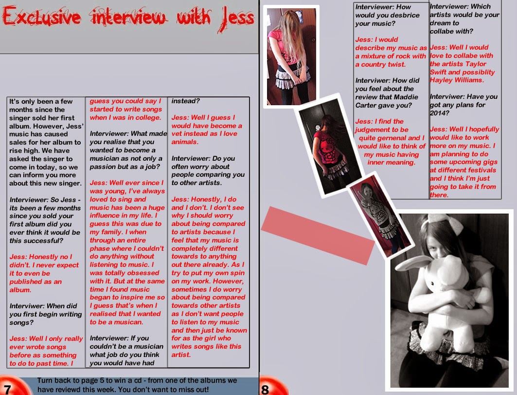
Then I drew faint boxes in the dead-space to give myself a rough idea of where I was placing the interview. I had to make sure that all the columns' sizes were the same size as it is often a common convention in magazines as well as making the magazine look more professional. Then I began to write out the interview in the columns, making sure that I used a different colour for the interviewer and for the singer. I also put an advertisement for a previous page in the magazine, in the banner by the page numbers as that is often a convention used in magazines.
Finally I added a quote from the singer - to give the audience an impression of what the singer's personality is like. I then also decided to add a chart stating the singer's successes and basic information about the singer's album which would further give the audience a better idea about her. Then I included an picture of the album with a price next to it. Furthermore, I then made sure I had written out a sub-heading and text under the sub-heading to inform the audience what the double page spread is about.
Friday, 3 January 2014
Drafts of Context Page
For my context page I first decided what font I was going to use for my heading; I decided that I would use the same font as my masthead as it can show that I have used an organised house style. I had to make sure that I placed a banner behind my font so that it would not mix into the background.
I then decided where I was going to place my images. I
placed them towards the sides of my context page - to create dead space where I
could then place my text. I made sure there were white boarders around my
images to make them see more like photos. I then placed the page numbers which
the images related to on there to give the audience an idea of what would be on
that page or who was being interviewed.
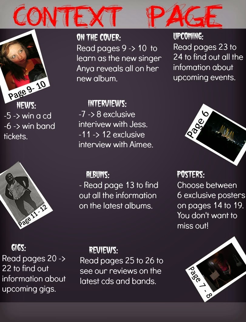
After that I then placed my text around the images and in
the dead space. I tried to pick a decent font size of 14 as it isn't too big
but it would be clear enough on the pages. I chose a san-serif font as it is
modern looking so it will attract my audience; additionally, it is clearer for
my target audience to read.
 Finally I placed banner behind the sub-headings to make them stand out from the page numbers text. I then re-placed my tag line at the bottom of the page to re-emphasis the aims of my product. I also placed a page number in the bottom left corner of the page; I have used the same shape as my kicker as it shows that I have used a constant house style throughout my media products.
Tuesday, 17 December 2013
Drafts of Front Cover
I first placed the image of the singer onto the background. I then had to make sure that I had placed the masthead behind the singer - to show that the singer is most important. I made sure that I had placed the kicker and masthead where I had on my layout. I felt that image of the singer is too stretched out and there's too much dead space.

I then I had resized the image of the singer and cut around parts of the image I didn't need as it would give more space which I could later use to place a banner there. I also made the background darker which has caused the masthead to look less bright.

While I then placed a banner in the dead space and started to add images to the banner. I added a tag line as it is a common convention used on music magazines; additionally, it gives the audience a better idea of what’s included in the magazine. I used clone stamp around the singer's head as it makes the image look more professional; as well it makes the image stand out infront of the masthead - showing that she is most important. I then moved the bar code to the corner to create more space - in which I have placed my main headline and sub-heading. I have also included the issue number and the magazine release date under my masthead.
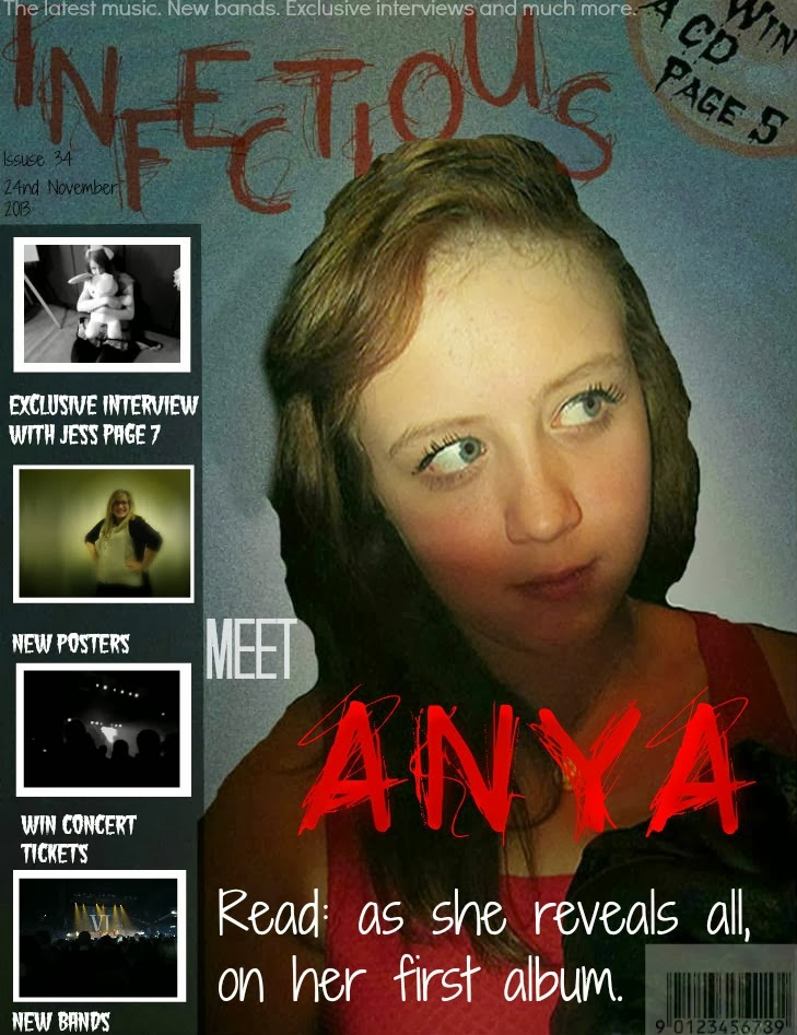
Finally I have added the rest of the images to the banner as it gives the reader a better idea of the information included in the magazine. Under the images I have included sub-headings; I made sure that the font which I used is
Monday, 16 December 2013
Sunday, 15 December 2013
Subscribe to:
Comments (Atom)


