Tuesday, 17 December 2013

Drafts of Front Cover


I first placed the image of the singer onto the background. I then had to make sure that I had placed the masthead behind the singer - to show that the singer is most important. I made sure that I had placed the kicker and masthead where I had on my layout. I felt that image of the singer is too stretched out and there's too much dead space.


I then I had resized the image of the singer and cut around parts of the image I didn't need as it would give more space which I could later use to place a banner there. I also made the background darker which has caused the masthead to look less bright.


While I then placed a banner in the dead space and started to add images to the banner. I added a tag line as it is a common convention used on music magazines; additionally, it gives the audience a better idea of what’s included in the magazine. I used clone stamp around the singer's head as it makes the image look more professional; as well it makes the image stand out infront of the masthead - showing that she is most important. I then moved the bar code to the corner to create more space - in which I have placed my main headline and sub-heading. I have also included the issue number and the magazine release date under my masthead.
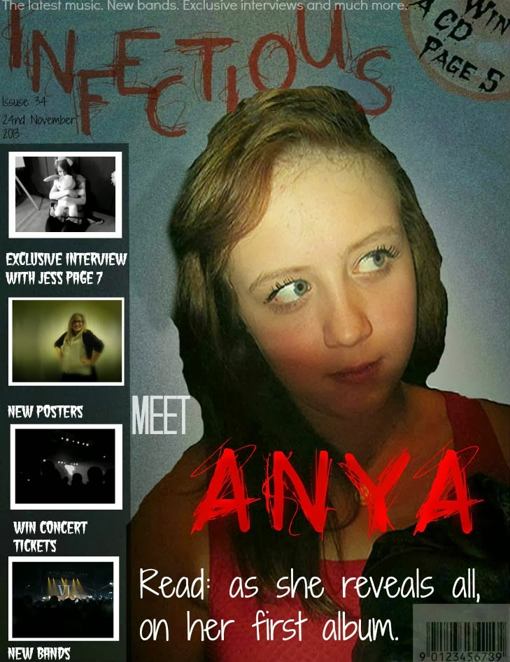


Finally I have added the rest of the images to the banner as it gives the reader a better idea of the information included in the magazine. Under the images I have included sub-headings; I made sure that the font which I used is

Friday, 13 December 2013

Feedback: Double Page Spread


Strengths:


  1. The quote from the singer is good as it can show some of the singer's personality and well as give the audience a better impression of the singer.
  2. The fact you have separated the interviewer's questions and then the singer's answers in two different colours is effective as it makes the interview easier to follow.
  3. The chart about the singer can be seen as a strength as it further inform the target audience about the singer and how successful they have been.
Weaknesses:
  1. The layout of the images can be seen as a weakness because of some of them looks like it is covering up some of the interview. This can make my double page spread look less professional.
  2. The font colour which the text under the sub heading is in - "Meet the...." can be hard to read against the background. Also I haven't used that light colour on the double page spread so it can imply that I haven't fully used the same constant house style throughout all of my media products.
  3. Another weakness is that both sides of the double page spread seem to be quite busy. This can be shown as a weakness because it could distract the target audience away from the interview.

Wednesday, 11 December 2013

Feedback on Context Page


Strengths:
  1. There isn't too many colours so this causes the context page to look less busy and it can show that you have used constant house style.
  2. There is a various of fonts. The serif-sans fonts are modern looking and it will appeal to your target audience; while the heading "Context Page" is written in the same font as your masthead, this can link into your theme of your magazine and well further show that you have used a constant house style.
  3. The images reflect well with the text and can give the reader an idea of who or what is mentioned in the magazine.
Weaknesses:
  1. The columns of text seem to be placed unevenly- making the context page look less professional.
  2. The repeat of tag-line font colour clashes against the background and is hard to read.
  3. The boxes around the sub-headings are too close colour as the background so this can make the white writing on top them of sometimes hard to read; furthermore, it can also make the context page look less professional.

Monday, 9 December 2013

Feedback: Front Cover


Strengths:
  1. As the masthead and the word "Anya" are the same style of font this can instantly show the audience that she is important in the issue.
  2. The banner with images can show the target audience of what is included in this issue. Additionally, the sub-headings under the images are short and often use the word "New" so this can shows that magazine is fully update with the latest music updates.
  3. The use of kicker promotes offers in the magazine so this could interest the target audience as well as inform them more about the offers or what is included in the magazine.
    Weaknesses:
    1. Some of the font size e.g. the issue number and the tag-line are quite small and it can make it hard for the audience to read.

    2. The bar-code is too transparent and it is unclear on the page.
    3. I dislike how the masthead is not as bright as it was planned to be, instead it looks duller and might not catch the interest of your target audience.